Thursday, March 2, 2023

6 - Referencing Film Intros

    As I mentioned last post, I started to observe the film intros that were listed under contemporary fantasy. I chose two, one of which I haven't seen. I also watch them by order of release, so I can ease into how the genre is portrayed throughout the years all the way to the closest modern representation. I've also barely watched Enchanted, but I will remove the context and look at the intro as if it were my first viewing. This way, I can interpret these elements objectively without any bias and see it through the eye of a new viewer. This will not at all be a full on analysis on each clip, since that isn't the point of why I'm doing this. Instead, I'll only point out details and choices that either stood out to me or ones I can potentially reference in the future.

    The first film intro I watched was Mary Poppins (1964). I put two links because the first video is primarily the opening credits and title sequence, while the second video the continuation after the sequence.


    Starting from the title sequence, it starts with an establishing shot of London, putting the landmark as the first thing the viewer sees. It slowly pans around the area while presenting each name. The font isn't uniform and seems as if it barely bends around itself, which fits into the overall tone right off the bat. Even though the city looks gloomy with the cold hues, the light purple clouds add some brightness to the scene. The main part that I accounted for was the cheerful music, since nearly everyone in the comments of the video took it to heart. It starts out slow as there are possibly a few leitmotifs that I didn't quite catch, and then gradually gets more cheerful. Although I haven't seen the movie, I already feel fondness through the intro possibly with my upbringing of old cartoons. The music gets the most cheerful when it removes the text for a bit and focuses on a mid shot of a lady sitting on a cloud.

    The next continued clip after the title sequence introduces the setting, time period, and type of society that occurs. They pair the primary character with others that will bring out his key traits upon first impression, such as his joyful demeanor, musical talent, and most likely low income. At the end, it feels strange for him to directly refer to the viewer, but it may have been a unique choice especially considering the time the film released.

    The next intro I watched was Enchanted (2007). Compared to Mary Poppins, this film is much more recent. It also incorporates elements of animation, which might give me guidance.


    Due to its basic premise, the start with a storybook sets the tone immediately. The art style and fluid animation also resembles Disney's older films. As Disney knows their audience, the viewers would most likely recognize the style and assume it would be similar. The intro also uses classic cliques in order to get across the stereotypical plot, such as an evil character, a prince, and a female main character that talks to animals. I noticed that there were was no credits sequence besides the production company, though it may have come later on. The bright and warm colors used as a palette for the latter half portrays the nature of the characters.

    I can use both of these intros as references for my own, though I would like to have my own take on it. Even if these intros set the basis of what a contemporary fantasy film is like, I would rather do more research on the genre itself. However, this acted as valuable information that I could potentially incorporate or reference for the project. 

Wednesday, February 22, 2023

5 - Idea? Possibility?

    There is already some drafted posts that will be published soon, but I needed to mention something that I considered a bit and came to me almost accidentally!

    Over the weekend, I was a bit stressed with a lot of things on my mind, some personal and some not. One of the ways I dealt with that stress was to go to my piano and let loose a little bit. Maybe not complete songs or pieces, but just some improv that I follow blindly to relax. For some background, I've been playing the piano for more than a decade, and I rely on my perfect pitch and muscle memory to either play whole classical pieces that break my wrist or just drabble a bit into something that sounds alright to the ears.

    At this point, I was still concerned about this project, so it was the only thing that went through my mind for that brief moment of sitting down at the piano. The mood of the intro replayed in my head, and after about a minute or two, I came up with this.


    Even if it was small, I got a little excited. Maybe I could use this for the intro?

    I showed it to people close to me, starting with my parents. I wasn't the only one that was stressed at the time, but they said after hearing me play they could imagine the small cat looking around the room and jumping about. They even mentioned that they thought about getting a microphone for the piano for a while now!

    When I sent the video to my friends, one of them pointed out that it sounded similar to songs that we've listened to together, such as Dark Waltz by 김재성 or Moonsetter by Toby Fox. I was and still am concerned about the similarity, but I'll choose to believe the words of Jack Stauber, an amazing pop singer and songwriter, while half-jokingly teaching a crowd how to write pop music, "We're going to start hearing things reminiscent of what we've already heard. And that's- don't even get discouraged by that because I'm like you know, 'come on, everything's already been made. It's fine. All my songs are ghostwritten by me.'" I'll only have to make sure they're not too reminiscent. 

    I get excited thinking about the possibilities of me writing the music for the intro, since I have a bunch of experience and variety in instruments (guitar, ukulele, kalimba, bass, melodica, etc.) I can utilize.  Then again, this is only an idea. I would love to follow through, but I already have my hands full with the production of the animation alone. Maybe I can refine this in my free time, but if it's way too much, then I'll leave it as just something I made in the moment. There is copyright free music available, and if I want to go the extra lightyear, I could find someone to compose over the intro. For now, I'll focus on what I need to do first.

Saturday, February 18, 2023

4 - Getting Ahead of Myself

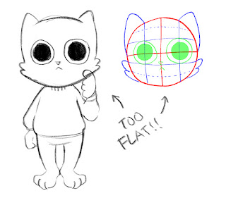
     Since I'm doing animation, I feel pressure to start right away, so I started immediately with planning the design of the protagonist! After that, I can build the framework for the film intro around the character. Since I wanted both the style to be simple for my own convenience and the character to be curious in a childlike way, I decided on an orange cat! The breed is technically a Tabby cat, but they are known to be the most mischievous cats out there. Much like how black cats relate to the supernatural, orange cats are known for their few playful braincells jumping around in their heads like a jingle bell. His main flaw and redeeming quality is that he is a child! To make it more fitting, making the protagonist a child would at least create enough context for the young audience to know their personality without needing to notice the orange fur patters, which may be hard to notice with everything being filled in with purely values and no hues.

    The first design choice, I wanted to make the design uniform so that consistency would be easier to do. However, I realized that this would be the complete opposite to the cat's personality, so I decided to let loose a little. Make him have a bit of floof! Exaggerate his expressions as much as possible! Give him simple, loose clothing! This would make it so that not only the cat's design but also his lively movements and cartoonish exaggerations fit the bill. The initial concept is the first image, as the redesign is the second.


    Here is the part where I start to get agitated.

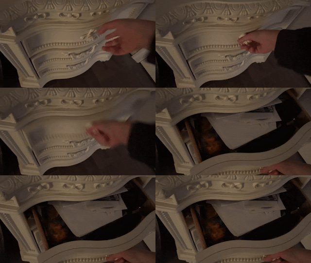
    I get up to film reference shots for the animation in my room. They were a lot of loose ideas that I wanted to add in, which featured a bunch of close-ups or POV shots for the cat rummaging around a bedroom. I even drew perspective lines on my arm to make it easier for me to decipher the reference in the future (although permanent sharpie was the first thing I saw, so I learned to use maybe makeup next time if I didn't want to be scrubbing soap on my arm six times in a row). I compiled some here, but due to being uncomfortable showing my face due to private reasons, I took some out for this specific post.


    I then mapped the scene I had in mind with a storyboard, going from top to bottom, left to right. I filmed each panel with my phone to get an idea of each shot's timing, and this storyboard makes up around 30 seconds.


    All this was rushed in one day. However, after taking a long nap the next day out of exhaustion, I realized that if I continue to do all this by ear out of crunching for time, then I won't know where I'm going in the first place. I need to do more research on the genre and look at some film intros that fit contemporary fantasy. I need to plan out a basic plot and think of an efficient way to introduce the story. In the next few blog posts, I'll observe film intros, and the next I will think of a plan of what I will do in the first place. If I don't prepare myself and this project, then it will take longer to do from the planning I would have to do midway and the mistakes I would make along the way. I got too ahead of myself!

Friday, February 17, 2023

3 - Genre and Medium: What Would Fit Best


    Now that I decided that I will do animation, this should let me have more creative liberty in the genre I'd like to use! There wouldn't me many limitations in character design for example, as I wouldn't need to buy any makeup, clothing, nor accessories to get the same costume design. The problem lies in the few parts of a story I want to tell, and how ambitious it might be compared to the workload and time limit. If I'm going to do animation, I need to plan quick and start immediately. I will list some options I singled out that I'll elaborate to make it easier to visualize.

Fantasy - "Featuring elements of the fantastic, often including magic, supernatural forces, or exotic fantasy worlds." 

Thriller - "A story that is usually a mix of fear and excitement . . . It generally has a dark of serious theme, which also makes it similar to drama.

Supernatural - "Exploits or requires as plot devices or themes some contradictions of the commonplace natural world and materialist assumptions about it.

    (The page also listed genres of animation, though I firmly believe in Guillermo del Toro's words, "Animation is a medium, not a genre- nor an interest in kids or families only." that animation is a medium that can fit any other film genre. Thankfully, it does clarify that this aspect is debated.)*

    Thriller can be good for exploiting the unknown, but it might be difficult to cultivate suspense in such a short time. The mood would be serious as well, which would impact the premise of the intro. I could come up with a scenario that also contains a lot of suspense, such as the main character being a murderer hiding their nature. Making them the protagonist might also make the suspense towards another party finding out rather than the murder doing any violent actions, since usually the viewer would root for the protagonist despite who they are. However, I'm not sure if it's a story I'd like to tell, or one I would be able to accurately portray.

    I actually already had an idea for this project, but I wasn't sure where it would fit in terms of genre. The premise is that character in a monotone world keeps a colored pen, defying the logic of that world. With the logic of that world, filling it in with a simple dark tone, mid tone, and highlight should make the workload easier. I might also make it a slice of life to contrast the nearly noir composition. The problem lies with a probing question; what is the difference between supernatural and fantasy?

    I tried checking multiple sources such as both the supernatural and fantasy Wikipedia pages, Goodreads, and Kindle Direct Publishing. From what I could deduce, fantasy can be interpreted as a main genre, and the supernatural can be either an element of it or a subgenre. There were some that said that the supernatural belonged to werewolves and ghosts, as fantasy was set in a different world. However, supernatural horror may be a different category by itself. The subgenre that I feel best describes this premise is contemporary fantasy, where the magic or supernatural occurs in our world. Some examples of films that were listed were Mary Poppins, Who Framed Rodger Rabbit, and Enchanted. The example that stood out to me is the second! It technically is our world, but what may be considered strange is normal in part of the worldbuilding, which relates to the aspect of the monotonous world.

    Overall, I decided to do a contemporary fantasy film! However, I would like to add an element of childlike wonder despite that previous remark*. I'd like to fit my premise, which will be explored in a post in the near future, to a curious protagonist that the viewers follow. The simple style would compliment the lighthearted tone, and the lighthearted tone would contrast with the color palette (or rather lack of color).

2 - Genre and Medium: To Animate, or Not to Animate

    Ever since the film intro was first announced, one question rang through my mind,

"should I animate this intro?"


    The answer a classmate who asked the same question and I made at first was no.

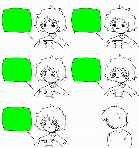
    There's too many pros and cons that would come up with even thinking about it, and deciding so would vastly change the outcome of the project down to the framework. Animation is something I want to major in though, and I've had a few experiences with making short ones. Below are two small examples of my experience. The left is from a flipbook of 50 frames I made for an animation class, and the right was my reaction to a show opening I liked a little too much.

A simplified person zooming out of the camera, doing a large, exaggerated windup with a scythe to slice an apple in half. They cut some of the plate and table with it.A cartoon version of past me watching their phone, slowly growing tears. They notice the viewer, immediately closing the phone and looking away.

    Since this type of decision felt almost beyond me, I looked to my friends and family for their input. Using their comments, recommendations, and support as well as my own for either side, we built a solid case for live filming and animation. This would likely be better to explain through a chart of pros and cons.

 PROS  CONS 
  • Animation is a medium I am passionate about, or look to do in the future.

  • I will not have to find any actors nor physically act in the project myself.

  • The project can be used as a good learning experience.

  • I will have full control of the mise en scène (for example, instead of finding a large span of grass to film at, I can create it myself).

  • I would have more creative freedom with visual style.

  • This project would become more personal in its process to finished product.
  • I may lose steam from my own initial ambition, making the finished product look half-baked.

  • The experience needed for this particular project can be beyond my expertise.

  • Even if I were to not have any physical actors, I may need to have at least one voice actor.

  • The effort I put might not be enough to finish until the deadline, mixing in with work I need to do for other classes.

  • I have much more experience with illustration instead of animation.

    Following the encouragement of everyone that I have consulted, I came to the decision that the medium for this project will be 2D digital animation. I do have some reluctance, but I have more confidence falling on this decision than I do with filming in real life (I may even merge some visual elements of real life into this medium, if it came to that decision). This can be a first step in focusing less on what can go wrong and shift the focus to what I can do right!

Wednesday, February 15, 2023

1 - Big Project, Small Steps

    My most recent media studies class, I among my classmates have been assigned one of the most exciting and dreading projects I've had the honor to work on! Dreading is a strong word, but it is a long-term project based on creating a film opening. The most I have worked on for a project, personal and professional, has been either a long all-nighter or a cramped week or two. Then again, I'm so hopeful that this project and documentation might help me achieve more organization and consistency! 

    On the topic of the project itself, I haven't exactly thought much of film openings at all. When the teacher opened the presentation for us to take notes on the guidelines and qualities of a film opening, I was initially confused on what it was. After understanding a bit, I dug through my memory of movies that I watched in the past and it all just clicked! I even told my parents about the lesson, and they were as confused as I was at first. It's almost like the first few scenes of a play; what is met to the audience after the curtain swings open will give them an idea of the general gist of the rest of the performance. At least that is what I concluded from my understanding, I'm learning about theatre in a separate class, so that probably leaked into my interpretation.

    It's all so interesting to think about, however I freeze when I realize that I'll have to create something similar. I'd love to take baby steps, but even for this amount of extended time, I'm not sure if this will be possible without a little extra push. I have hopes that it won't become too stressful of a push, and even then, I'll rely on the coping tactics I learned through dealing with my anxiety as a lifeline. After deciding the genre and medium (elaborated further in the next post or two), the number one check on my to-do list is to create a personal schedule to follow through on!

A calendar titled "February" with an image of a cat, containing the days of the month below the cat.

    I'll have to buy a physical calendar, that might motivate me more. I'll get one with cute cats so I can't help but look at it.

Saturday, January 28, 2023

Music Marketing!!

  WOOOO!!

   Our group for this project made up an artist by the name of Paper Blues, specializing in the rock music genre. The first aspect we chose to focus on was the song, and through that song we branched out the aesthetic and style of this artist. The final choice was 5 Seconds by Twin Shadow, a fairly recent song by rock standards. With this, the target audience was chosen to be younger than the usual for rock. Normally, the genre would have a target audience of Millennials to Generation X, but branching out to Generation Z (11-26 years old) would be more beneficial as they would use much more social media than other age ranges. The physical age of the artist would make the audience relate more as well. Perhaps the subgenre of Indie Rock may do us good as an introduction, presenting the song(s) to social media platforms such as TikTok, Instagram, YouTube, or Twitter may work to give exposure.

    The storyboarding relied on the interpretation of the song. Our group read over the lyrics repeatedly trying to make sense of it. There were some users on lyric websites that described the singer as having a toxic relationship they cannot get out of, while others said that they might only miss the 80's more than usual. We finalized the interpretation with a couple blaming each other for the relationship being toxic in the first place. As we were too shy to both be on camera or ask anyone else to be in the music video, we settled to do the filming ourselves with a paper bag on, which opened a lot of opportunities.

    For one, since both subjects were female (or assigned female at birth), the artist would appeal to a younger generation that is quickly growing older. Through this logic, we also decided on making the artist nonbinary, as they have a feminine body but masculine voice. The appeal of a masked singer itself can be beneficial to marketing, as the paper bag not only relates to the name of the artist but also the brand as well. The simple design of a paper bag with two mismatched eyes is also designed to be simple and recognizable. The mystique of a covered face also lures in curiosity into who their identity might be. This can also be used for our exposure, making videos on YouTube with typical clickbait titles as the artist does street performances.

What follow are screenshots that are part of our planning, as of now we are still filming and working. I hope what we make will be amazing!


6 - Referencing Film Intros

     As I mentioned last post, I started to observe the film intros that were listed under contemporary fantasy. I chose two, one of which I...